# Frequently asked questions
- Is it possible to change also images which are already uploaded?
- Have installed and enabled XT Adaptive Images and Jotcache, but images are not scaled?
- Do I have to change/adjust breaking points?
- To test, I am navigating with my desktop browser and simulating different page sizes, Ok?
- Which image is rendered according to the device resolution?
- Deprecated notices in the extension output
# Is it possible to change also images which are already uploaded?
Yes. XT Adaptive Images (opens new window) works for all uploaded images. Even if you delete the folder of adapted images, it will also re-generate them. Additionally, if you re-upload an image, it re-generates it as well.
Finally, XT Massive Image Optimizer (opens new window) is also designed to process all images in batch processing.
# Have installed and enabled XT Adaptive Images and Jotcache, but images are not scaled?
Please, check the following quick setup https://www.extly.com/docs/others/xt-adaptive_images_/overview (opens new window)
# Alternative 1: JotCache - Joomla 3
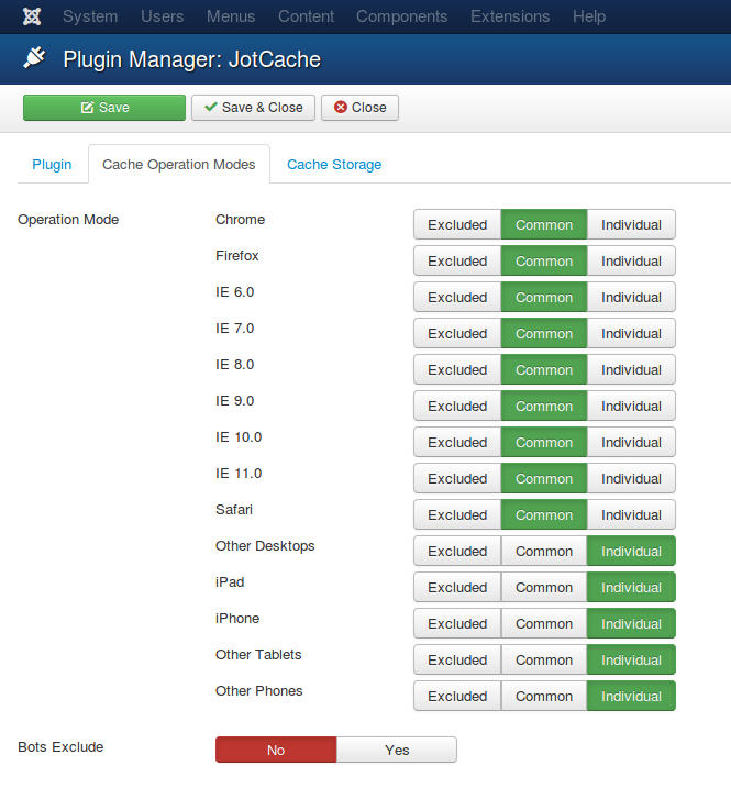
Remember to configure JotCache device-dependent cache (opens new window) (otherwise, you have one cache for the whole site and devices):
# Alternative 2: Platform Specific Caching - Joomla 3 or Joomla 4
TIP
For Joomla! 3.5.1 or superior, including Joomla 4: Joomla has included a new cache mode: Platform Specific Caching. 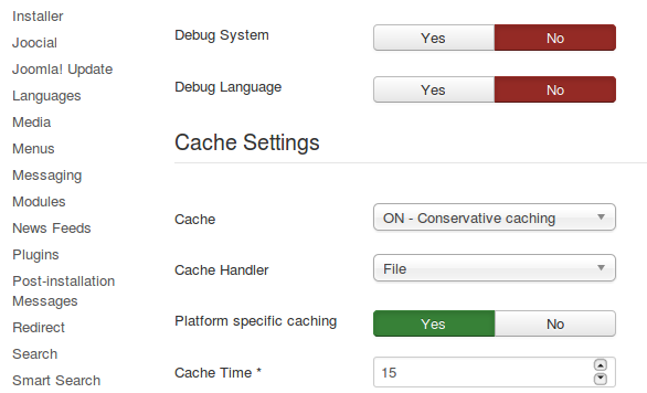
Please, test with a simple big image in images/ directory and verify the generated images.
# Do I have to change/adjust breaking points?
About breaking points, you can configure them according to your needs.
By default, plugin implements general breaking points. From a performance point of view, small images are very similar and more breaking points do not offer any gain. A mobile device can easily resize them on the fly to render the page.
# To test, I am navigating with my desktop browser and simulating different page sizes, Ok?
The best way to test is with several real devices and screen sizes.
Desktop browsers can simulate different screen sizes, but the most accurate tests are only achieved with real devices.
Take into account that the plugin has a resolution cookie. If you change the page size to simulate devices, then you must manually remove the "resolution" cookie between tests. For instance, this is a sample resolution cookie for a simulated iPhone 5/SE:
# Which image is rendered according to the device resolution?
These are the variables that affect how an image is rendered:
- Each device has a screen size.
- The browser has a page size, smaller than the full size of the screen.
- The image has an available canvas, calculated dynamically by the browser, where the image is displayed.
- The user can visit the page in landscape mode so that the coordinates can be inverted at any time.
TIP
we recommend keeping the default resolutions: 1382,992,768,480. They represent the average breakpoints that work for most devices, and they are tested on a full set of resolutions.
The plugin uses a resolution cookie to detect and calculate the best breakpoint. The plugin delivers the best image in the image src attribute according to the detected resolution. If resolution falls in the middle of two break points, then the plugin delivers the best resolution for that case.
Finally, modern browsers support the srcset image attribute, and the plugin can also generate all images to fill it according to the breakpoint. In this way, the browser knows the available files to choose the right image according to the available space. For instance: even if the device has a big screen if the browser detects a small canvas for the image, and the srcset declares a lower resolution image, then it picks the right image for the case.
# Deprecated notices in the extension output
- Warning: "continue" targeting switch is equivalent to "break"
- Deprecated: Function create_function() is deprecated in ...
# Understanding Extension Notices
Sometimes, when using certain extensions, you might encounter notices about specific elements being deprecated. It's important to understand what these notices mean and how they affect your website.
# What are Deprecation Notices?
In simpler terms, a deprecation notice is like a heads-up from the extension. It's letting you know that certain parts of its code are not going to be supported in future versions of PHP, particularly PHP 8. These notices are not errors; they're just reminders for developers to pay attention to potential changes.
# Our Ongoing Work
Rest assured, our development team is actively working on the next version of the extension. This upcoming release will seamlessly integrate with PHP 8 and won't support older PHP versions. So, while you may see these notices now, they will not affect your website's functionality in the future.
# Managing Notices
For the time being, you can safely ignore these notices. However, if they bother you or clutter your development environment, you have the option to adjust your site's error reporting settings. These notices typically appear when your site is in development mode or when maximum error reporting is enabled.
# Recommended Configuration for Live Sites
When your site is live and serving visitors, we recommend setting the "Error Reporting" to "None". This ensures a clean and tidy user experience without exposing internal information or distracting users with unnecessary notices. Importantly, this configuration won't impact the functionality of your installed extensions.
By following these guidelines, you can maintain a smooth and efficient website experience for both developers and end-users alike.