XT Adaptive Images
Delivers the right images to the right device
XT Adaptive Images works on your website by generating images of different sizes to match your visitor’s screen size. Created with a mobile-first philosophy, this plugin will dramatically improve your website performance.

Features
Responsive images
XT Adaptive Images generates and delivers re-scaled versions of your website's images according to the screen size detected. Created using the latest HTML's new features for desktop and mobile, it uses responsive designs combined with Fluid Image techniques to deliver outstanding images.

Lazy Load
XT Adaptive Images also includes Lazy Load images. This technique delays the loading of images in web pages, making them load when visible to the users, thereby improving the page loading time.

Easy and powerful configuration
XT Adaptive Images can be fully integrated to deliver images even from your Content Delivery Network (CDN). No markup changes are required. Just define the breaking points you need, taking into account your visitor’s devices.

Pricing
Take action today. We have a plan for you!
 Buy now
Requirements - GNU GPL v3.0 License - Pre-Sales FAQ - Installation Services
If you are renewing, please log in to your account before the purchase and remember to apply the loyalty coupon (20% Off).
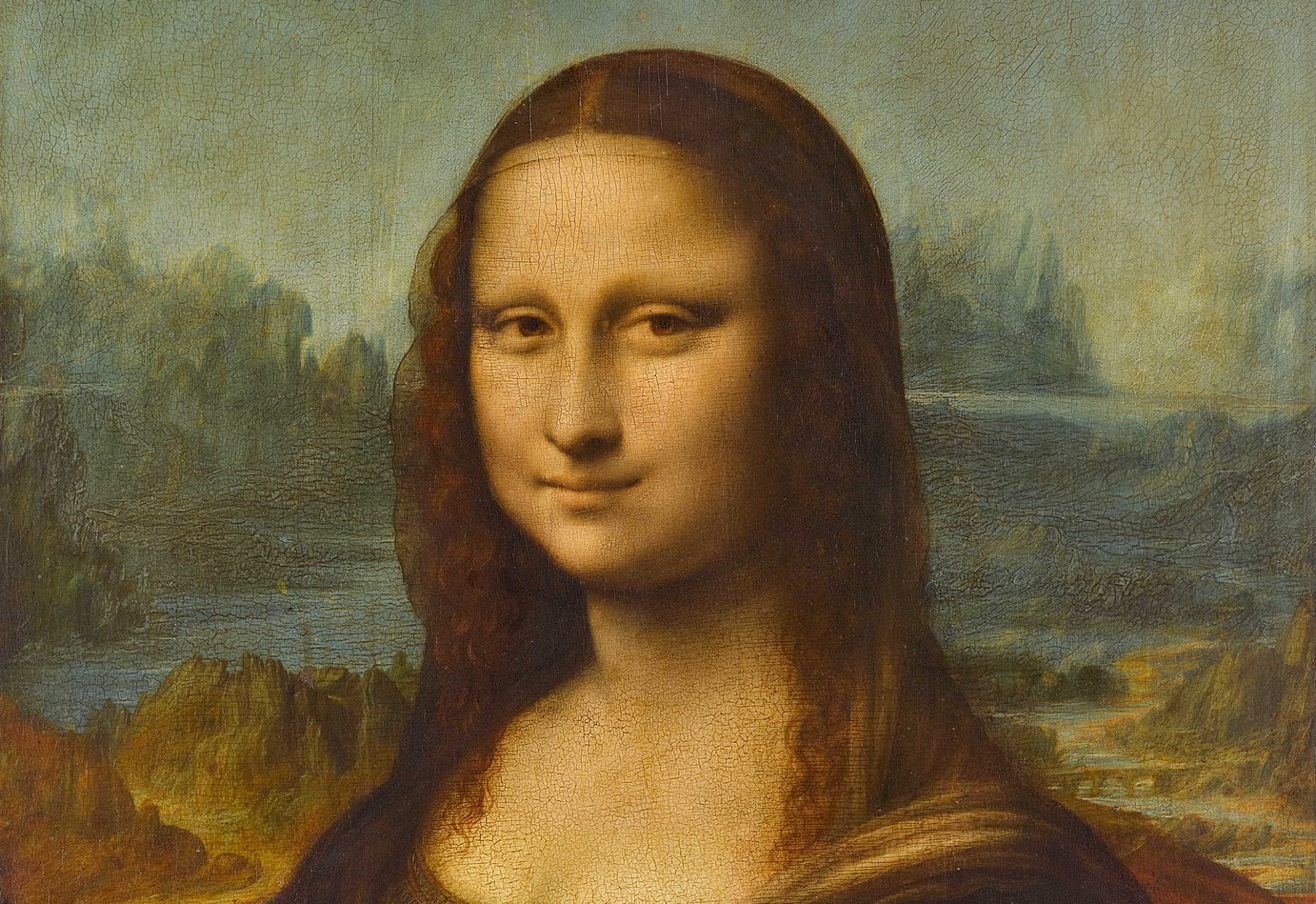
Examples and Demos
The images on our site are processed with XT Adaptive Images. On a desktop, they are delivered from our CDN with no modification. On tablets, phones, or phablets, they are delivered from the CDN, but images are modified to fit the screen size.
For further information, visit our documentation:
Example in action (default breaking points):
- Large
- 200 Kb
- 1382px
- Standard
- 100Kb
- 992px
- Tablets
- 70Kb
- 768px
- Mobile
- 30Kb
- 480px
 Contact Us
 Legal
Legal


